Table of Contents
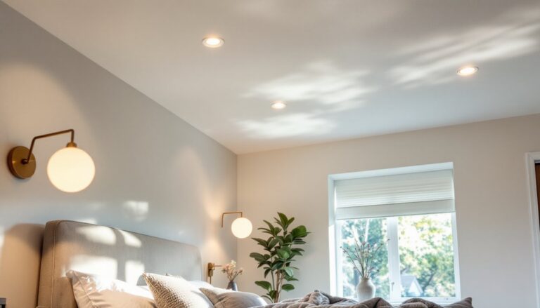
ToggleYour bedroom is your sanctuary, the one room where comfort should trump all else. Yet many DIYers overlook paint color as a transformative tool, defaulting to builder-grade white or beige without thinking through how light, mood, and personal style factor in. The good news? A fresh coat of paint is one of the most affordable and impactful bedroom upgrades you can tackle yourself. Whether you’re after serene, restful hues or bold accent walls that anchor your design, picking the right bedroom wall paint ideas starts with understanding how color affects sleep, space perception, and daily mood. This guide walks you through timeless palettes and modern techniques to help you make a choice that fits both your style and your room’s unique dimensions and lighting.
Key Takeaways
- Neutral colors like soft greige, warm white, and pale blue promote better sleep and remain the most popular choice for bedroom wall paint ideas because they reduce visual stimulation at night.
- Test paint colors under your room’s actual lighting conditions across multiple times of day, as morning, afternoon, and evening light dramatically change how neutrals and bold colors appear on walls.
- Deep jewel tones (navy, forest green, sapphire, plum) deliver luxe drama on accent walls and work well in 2025–2026 design trends, but require quality primer and careful prep to reveal their true color.
- Room size and natural light direction are non-negotiable factors: small bedrooms need light, reflective colors to feel airier, while large bedrooms can handle deeper, saturated tones for intimacy and visual anchoring.
- Modern paint techniques like color blocking, stripes, and ombre effects add visual interest and magazine-worthy results when executed with high-quality painter’s tape, proper surface prep, and patience between coats.
Calming Neutral Tones for Restful Sleep
Neutral colors, soft greiges, warm whites, pale blues, and muted sage, remain the top choice for bedrooms because they genuinely support better sleep. Your brain associates low-contrast, cool or warm neutrals with rest, while saturated or high-gloss finishes can keep you visually stimulated at night.
Soft greige (a blend of gray and beige) is the workhorse neutral right now. It pulls warmth from the beige but adds the sophistication of gray, so it doesn’t feel flat or cold, especially important in north-facing rooms where natural light skews cooler. Warm white and ivory remain timeless because they reflect light and make compact bedrooms feel airier without feeling clinical. If you want something slightly richer, warm taupe or pale greige anchors a room without demanding attention.
The key to nailing a neutral palette is paint finish and undertone. Use a flat or matte finish (not glossy), which absorbs light and softens the room’s visual energy. Look closely at paint samples under your room’s actual lighting, morning, afternoon, and evening. A neutral that looks soothing at the paint store can lean too pink, yellow, or blue once it covers all four walls. Test large swatches (at least 2 feet by 2 feet) and live with them for a few days.
Pair your neutral base with white trim and a quality satin or semi-gloss finish on woodwork: this contrast keeps the room from feeling flat while preserving the calm aesthetic.
Bold Accent Wall Ideas to Define Your Space
An accent wall, painting one wall a distinctly different color while the other three stay neutral, is the DIY shortcut to personality without overwhelming your bedroom. The wall behind your bed is the obvious choice, but consider your room’s focal points: a wall with a window, a built-in bookshelf, or even a nook can shine with unexpected color.
Before committing, test your color choice on that specific wall. Lighting changes dramatically depending on which direction the wall faces and how much direct sun it gets. A color that looks moody and sophisticated in a west-facing bedroom might feel dark and cave-like in a north-facing room.
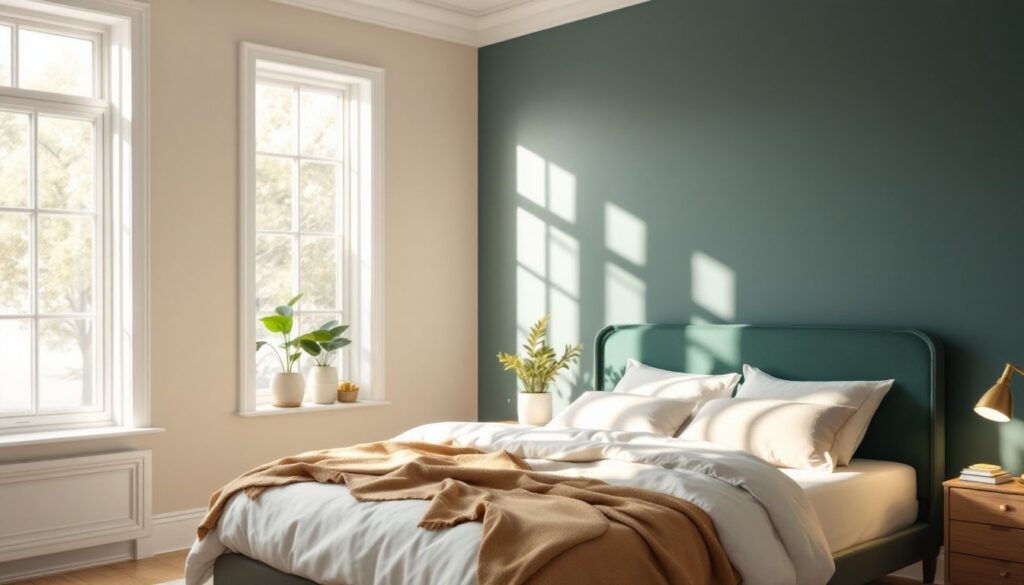
Deep Jewel Tones for Drama
Deep jewel tones, navy, forest green, sapphire blue, and rich plum, have dominated 2025 and are carrying forward into 2026. These colors feel luxe without requiring expensive furnishings: they ground a room and create visual depth, making smaller bedrooms feel more intentional and curated. Navy works across most lighting conditions and pairs beautifully with warm metallics like brass or copper. Forest green leans earthy and calm, while sapphire and plum demand confidence but reward it with drama and coziness.
When painting a deep jewel tone accent wall, prep is non-negotiable. Use a quality primer (two coats if the wall was previously dark or stained) to ensure even coverage and true color. Jewel tones reveal every brush stroke and imperfection, so invest time in surface preparation: sand any glossy areas, fill cracks, and caulk gaps along trim and corners. Aim for a satin or matte finish, gloss will make the color feel plastic and overly polished.
Warm Earth Tones for Coziness
Warm earth tones, terracotta, rust, warm ochre, and dusty clay, suit bedrooms oriented toward comfort and natural material aesthetics. These hues echo soil, leather, and ceramics, triggering a primal sense of safety and groundedness. They’re also forgiving: they hide minor paint imperfections better than jewel tones and complement wood furniture and warm textiles naturally.
Terracotta and rust read best in bedrooms with good natural light or ample warm artificial lighting. In dim bedrooms, they can feel oppressive. Warm ochre splits the difference, earthy without the heaviness. These tones pair exceptionally well with linen, rattan, and wooden accents, making them ideal if your decor leans toward natural materials.
Apply warm earth tones with a flat or matte finish to avoid a dated, synthetic sheen. One coat of quality paint over proper primer usually suffices, though darker rust shades may need two coats for even coverage.
Modern Paint Techniques to Elevate Your Design
Beyond solid accent walls, modern paint techniques let you add texture, depth, and visual interest without hiring a professional. Techniques like color blocking, striping, and geometric patterns have become accessible to DIYers and deliver magazine-worthy results with proper planning.
Color blocking, painting geometric sections of your wall in two or more complementary colors, works best with high-contrast palettes (navy and white, sage and cream, terracotta and soft gray). Use painter’s tape and a level to mark your sections, then paint carefully along the tape lines. A slightly imperfect edge can read as intentionally organic: make sure your tape is pressed firmly and allow paint to dry fully before removing it.
Horizontal or vertical stripes create movement and can subtly alter a room’s proportions. Vertical stripes make ceilings feel taller: horizontal stripes visually widen a narrow bedroom. Use low-tack painter’s tape and measure precisely, mark your stripe width lightly in pencil first, then apply tape. Paint your accent color, let it dry, remove the tape, then paint the base color to fill the gaps. Stripes require patience and a steady hand, but creative paint ideas for room makeovers demonstrate how effective even simple stripes can be.
Ombre or gradient effects, where one color gradually shifts to another, demand more skill but create a sophisticated, almost artistic result. Mix three or four shades of your chosen color (from light to dark) and blend them as you move up or across the wall. This is challenging to execute flawlessly, so practice on poster board or drywall scraps first.
For any technique, use quality painter’s tape (not bargain masking tape, which allows paint to bleed), and apply it firmly along every edge. Allow paint to dry completely between coats, typically 4 hours for latex, 24 hours for oils, before removing tape.
Choosing Paint Colors Based on Room Size and Lighting
Room size and natural lighting are non-negotiable factors in color selection. Ignore them, and you’ll end up repainting in frustration.
Small bedrooms benefit from light, cool colors that reflect light and visually expand the space. Pale blues, soft greiges, and warm whites make a cramped bedroom feel airier. Dark or saturated colors absorb light and make small rooms feel cave-like, though a single deep accent wall can work if the rest of the room stays light. Matte finishes also feel roomier because they diffuse light softly instead of creating reflective glare.
Large bedrooms can handle deeper, warmer, or more saturated colors without feeling cramped. In fact, a large bedroom painted white or pale beige often feels cold and impersonal. Deep jewel tones, warm earth tones, and even moderately saturated blues create intimacy and anchor the space. Consider using different accent walls or color blocking to define seating areas or create visual separation.
Natural light direction shapes color perception dramatically. North-facing rooms receive cool, indirect light, so warm neutrals and warm earth tones compensate by making the space feel cozier. Cool colors (blues, cool grays) risk feeling chilly. South-facing bedrooms receive warm, intense light, so cool neutrals, cool grays, and cooler jewel tones balance the warmth without feeling washed out. East-facing rooms get bright morning light, which suits any palette. West-facing bedrooms receive hot afternoon sun, so mid-tone or slightly cool colors prevent the space from feeling too warm or oversaturated.
Before painting, test your chosen color in different lighting conditions across several days. Morning light looks entirely different from evening light, and seasonal changes shift light quality too. Interior design resources like Home Bunch and Addicted 2 Decorating showcase how the same paint color performs across different bedroom contexts, a great way to anticipate outcomes.
Always purchase quality paint from a hardware store or home center where staff can advise on primers, coverage rates (typically 350–400 square feet per gallon for latex), and undertones specific to your lighting. Cheap paint requires more coats, shows more brush marks, and hides dust and imperfections poorly.
Conclusion
Choosing the right bedroom wall paint ideas is fundamentally about matching color to purpose, restful sleep, personal style, and your room’s physical characteristics. Start with neutrals if you’re hesitant: layer in bold accents once you’re confident in your space’s lighting and your design preferences. Take time with prep work, test colors thoroughly, and don’t rush the painting process itself. Your future self, rolling over in a bedroom that feels genuinely like yours, will thank you.